In short
At KPN, I designed Forma Urbis: a scalable UX blueprint for turning complex cost and usage data into clear, actionable insight for business customers. Instead of creating “another dashboard”, the concept standardizes one recognizable Insights experience that consistently guides users from a signal, to an explanation, to the right next step.
A UX blueprint, in this context, is a reusable information architecture plus an interaction route that multiple teams can apply consistently across different insight types.
The problem
Business customers often have access to a lot of data, but still struggle to get real insight. Information can be spread across different places, patterns are inconsistent, and the meaning behind numbers is not always clear. The result is time lost on searching and interpreting, and uncertainty about what to do next.
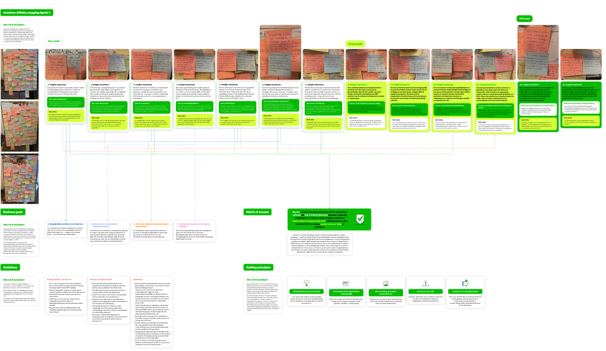
My challenge: How can I design a UX blueprint that helps MijnKPN Business customers gain insight into their costs and consumption/usage, regardless of the complexity of the data?
My role
I owned the end-to-end UX process, from research to validated design direction. I ran interviews and stakeholder sessions, translated input into user needs and guiding principles, designed the information architecture and interaction route, and built prototypes in Figma.
I then validated representative journeys through usability sessions, iterated on navigation and content hierarchy, and documented the blueprint so it can be reused and scaled by other teams.
Research & Concept Development
I started by mapping how people currently try to understand costs and usage and where the experience breaks down. I combined stakeholder input with customer interviews, then synthesized patterns using affinity mapping and journey mapping to pinpoint the moments where users lose orientation or confidence.
From there I reframed “insight” as more than displaying numbers: insight only exists when the interface provides meaning and supports a next step. That framing guided the blueprint’s structure, which is organized around customer questions rather than internal system logic.

Testing, Developing & Finalizing
I tested representative journeys that reflect real customer goals, using clickable prototypes and scenario-based tasks. The focus was not whether users “liked” the UI, but whether the route works: can someone find the right entry point, understand what the insight means, drill down without getting lost, and end up in the right place to act?
Feedback loops led to iterations in hierarchy, naming, and drill-down behavior, resulting in a more predictable structure that stays understandable as complexity in data increases.
Solution
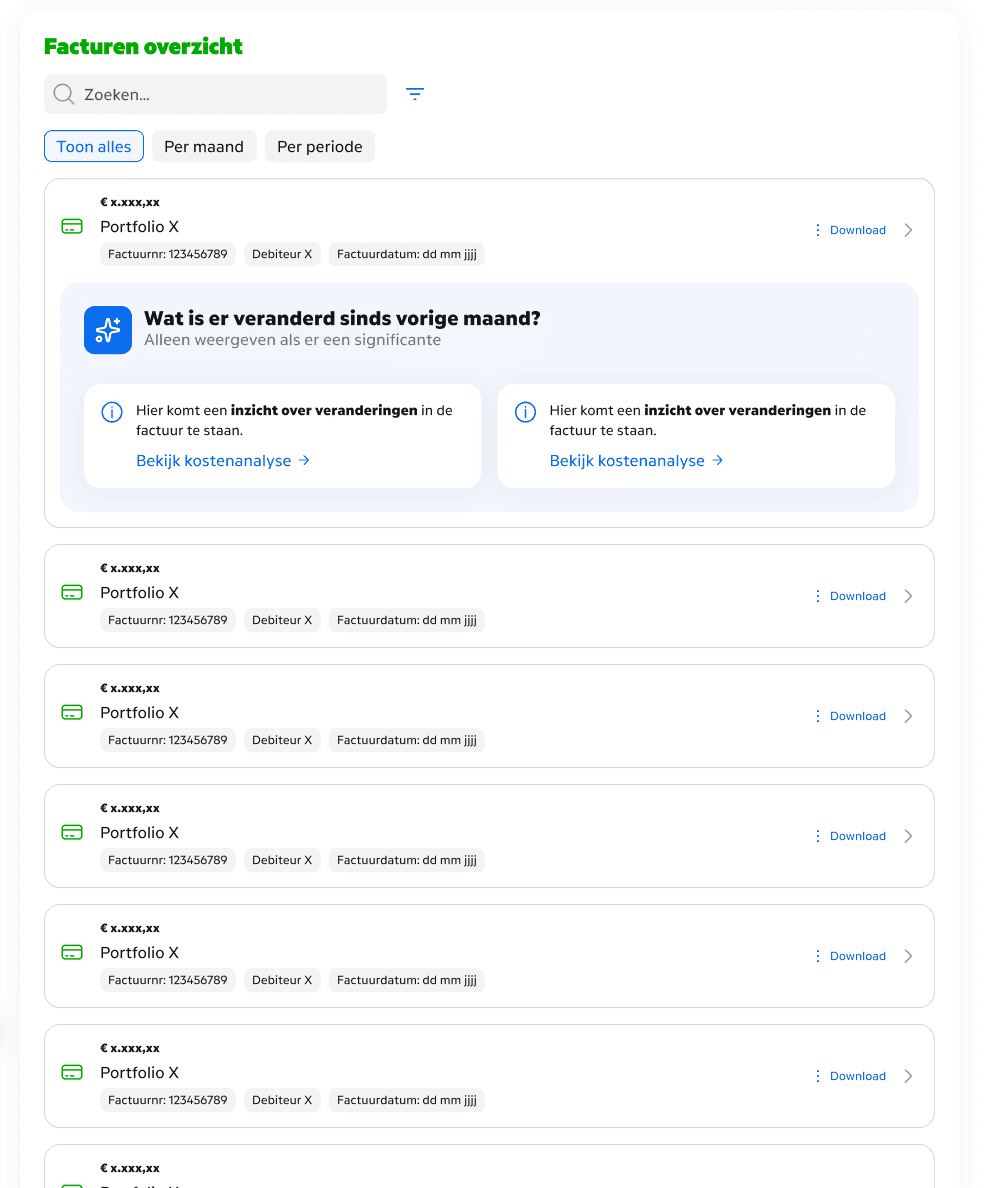
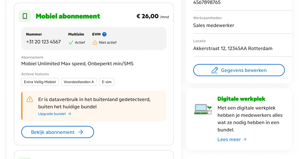
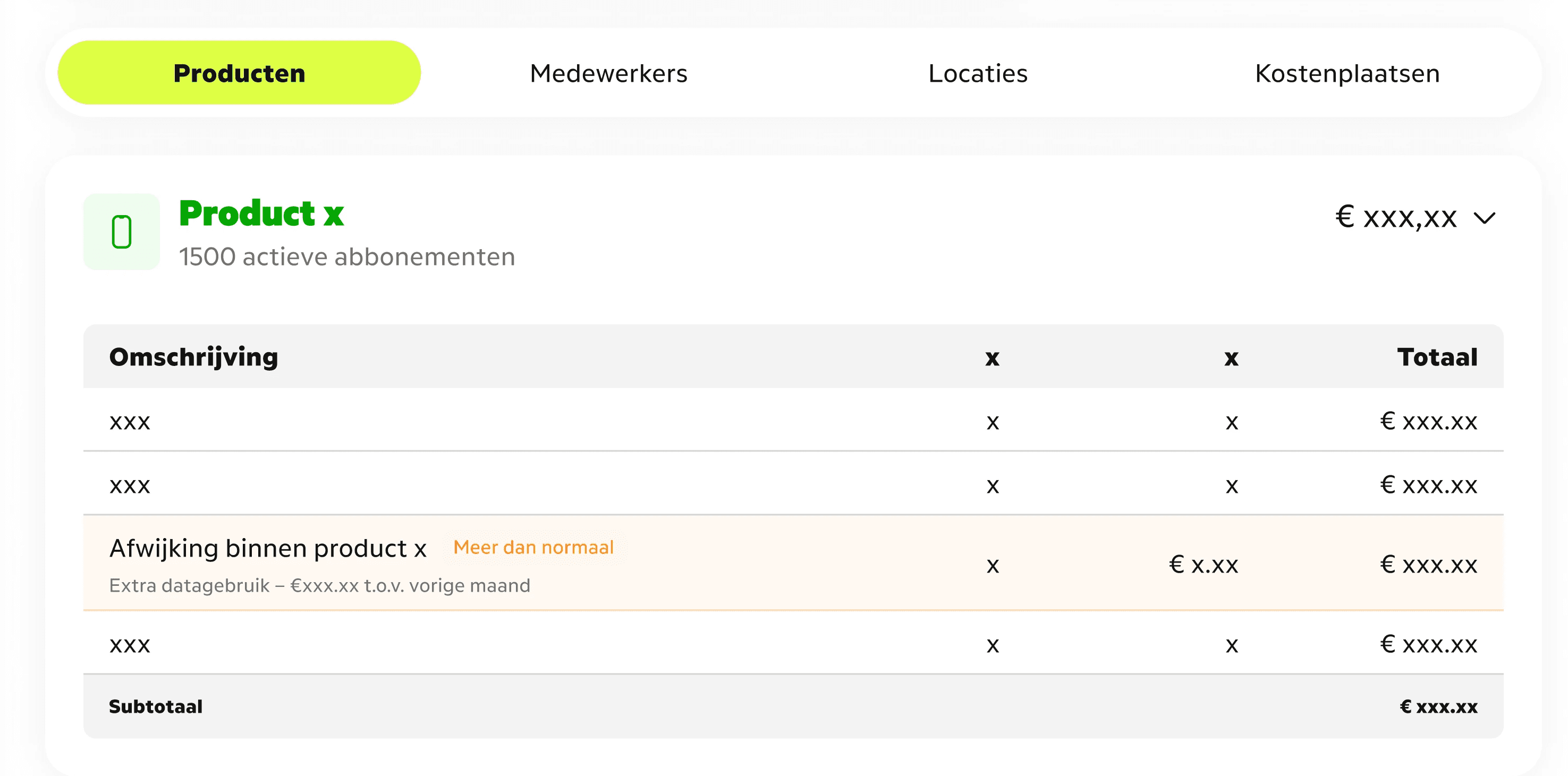
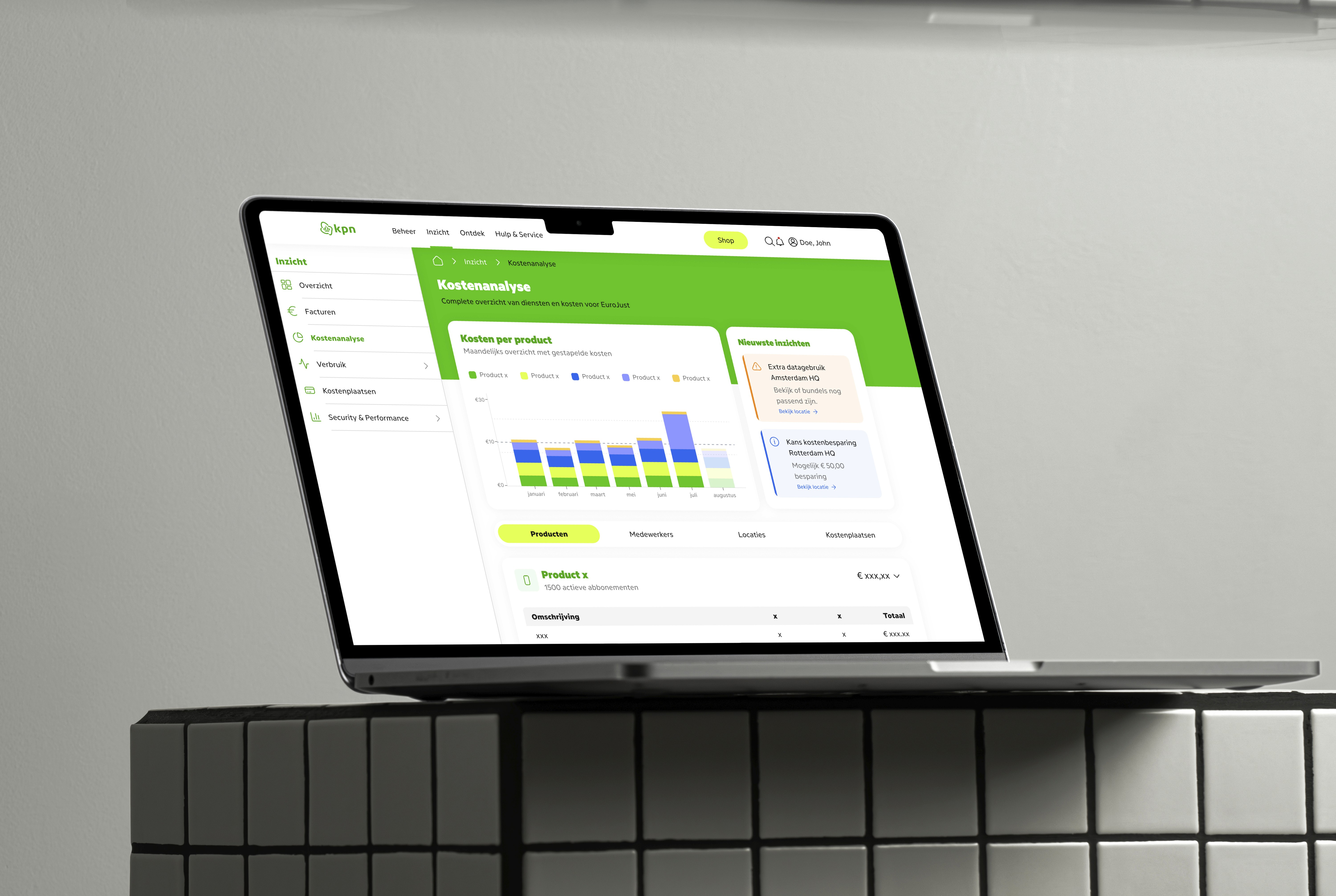
Forma Urbis is a blueprint for a central Insights experience with a fixed route: overview, deep dive, then a handoff to the appropriate place to act. The design keeps orientation stable through a persistent navigation structure, supports optional depth instead of forcing complexity, and follows a link-to-source principle: Insights explains and guides, while actions happen where they belong. Because the route stays the same while the content can expand based on context, the approach remains scalable as customers add more services, locations, and data.
Before, users piece together information across different places and interpret numbers on their own before they know what to do. After, they follow one guided route that clarifies what’s happening, why it matters, and where the next step lives.