
In short
Samen Besparen is a mobile app that helps low-literate and practically educated families save energy together. Through gamified challenges and simple visual feedback, users are encouraged to complete energy-saving tasks as a household. The app is offered as an extra service by Essent, giving their customers tools to take part in the energy transition in a fun, accessible way.
The problem
Families with limited literacy skills often struggle with complex or abstract information. This project aimed to offer these households a clear, motivating and easy-to-use way to take energy-saving actions, with a focus on long-term behavioral change.
My role
I led the full design process, from redefining user needs and business goals to concepting, testing and delivering a hi-fi prototype. I used methods like co-design, card sorting, heuristic evaluations and a unique translated prototype to simulate low-literacy testing.
Design process
The project followed an iterative and structured process, in which each phase built on the insights from the one before. I started by reinterpreting earlier research to formulate updated user needs and business goals. Based on these, I developed the Samen Besparen concept, focusing on family-based motivation and gamification. I structured the app using methods like card sorting and affinity mapping, and defined the feature set and content strategy through co-design with the intended users.
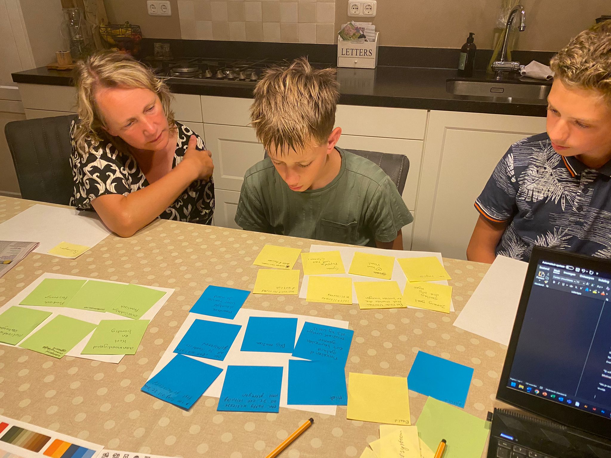

In order to test accessibility, I translated a low-fidelity prototype into Chinese, allowing Dutch-speaking test participants to experience the interface as someone with low literacy would. Their input, combined with heuristic evaluations from peers, led to the development of a validated high-fidelity prototype. At every stage, I compared findings with the tools and methods I had used, ensuring consistency and continuous improvement across the design.
Solution
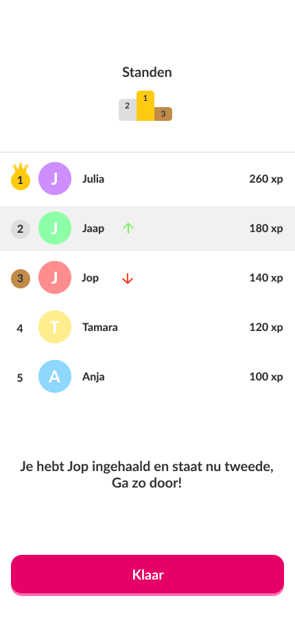
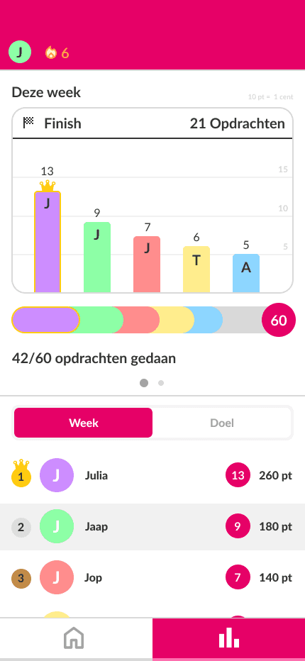
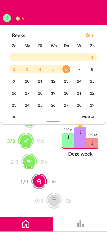
The app uses household competition and clear visual feedback to make energy saving fun and engaging. The tone is friendly, the language is simple, and users gain a better sense of impact through direct interaction with everyday tasks. The final prototype shows how thoughtful design can empower people who are often excluded from digital tools. This project sharpened my ability to work inclusively and made me more aware of how research and design come together in real-world impact.


Can't wait?
Gerealiseerd door Stijn Overeem @2026